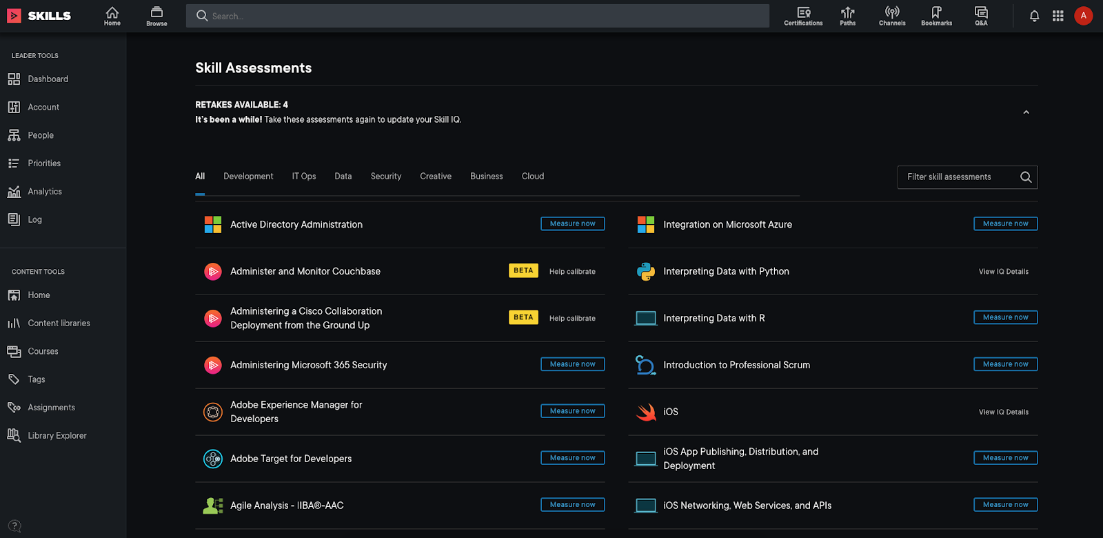
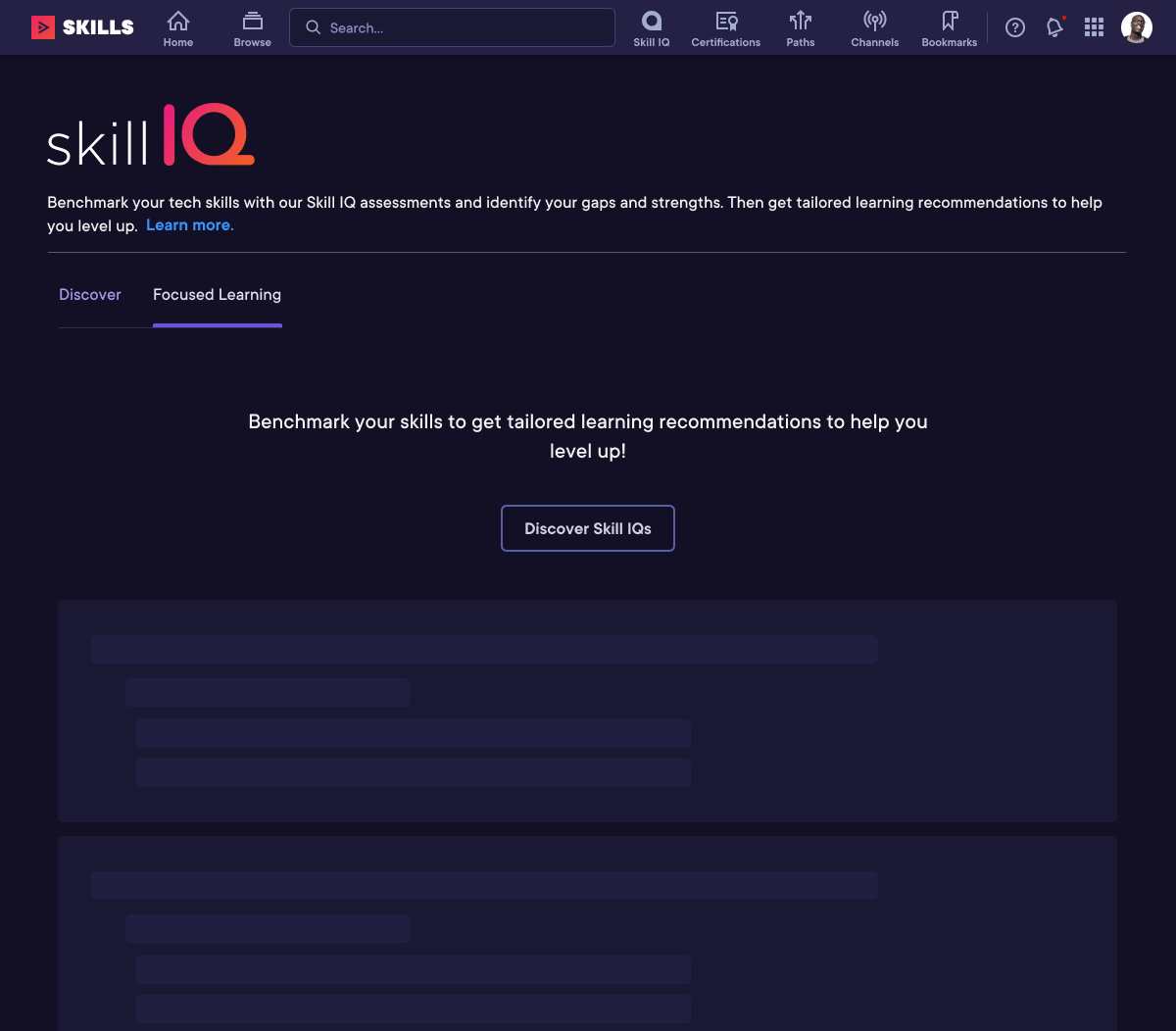
Screenshot of original Skill IQ landing area before updates
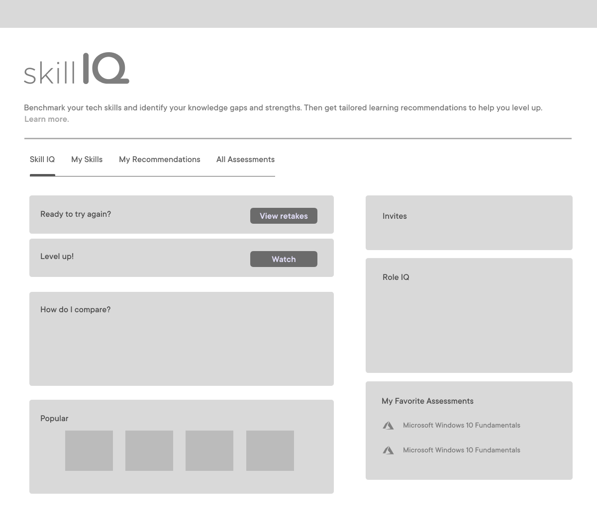
Wireframe of Skill IQ Dashboard
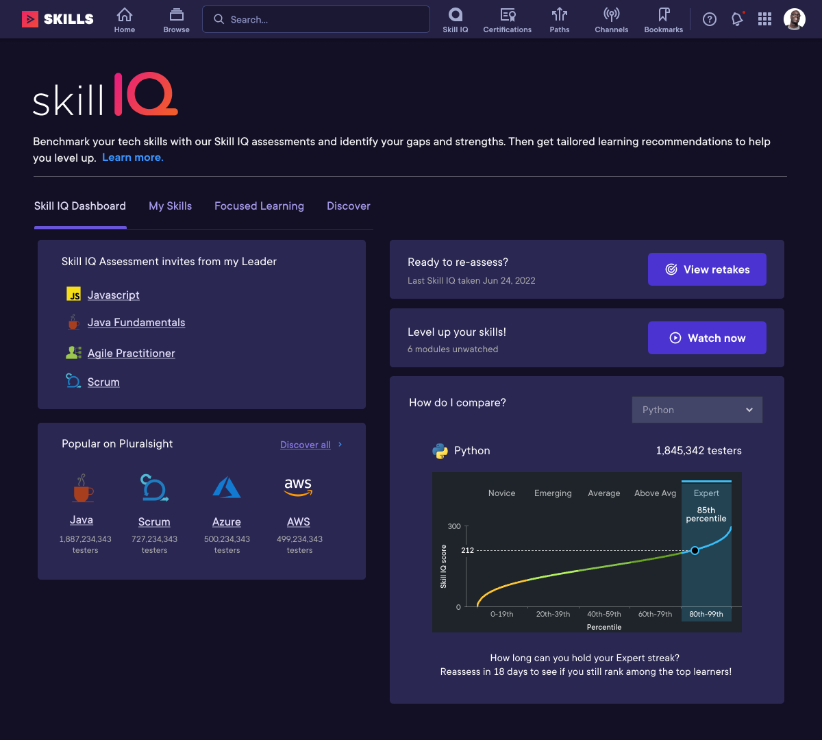
Skill IQ Dashboard
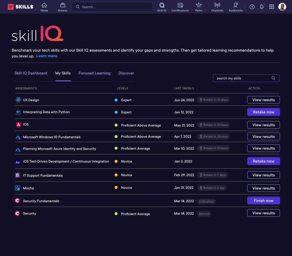
My Skills
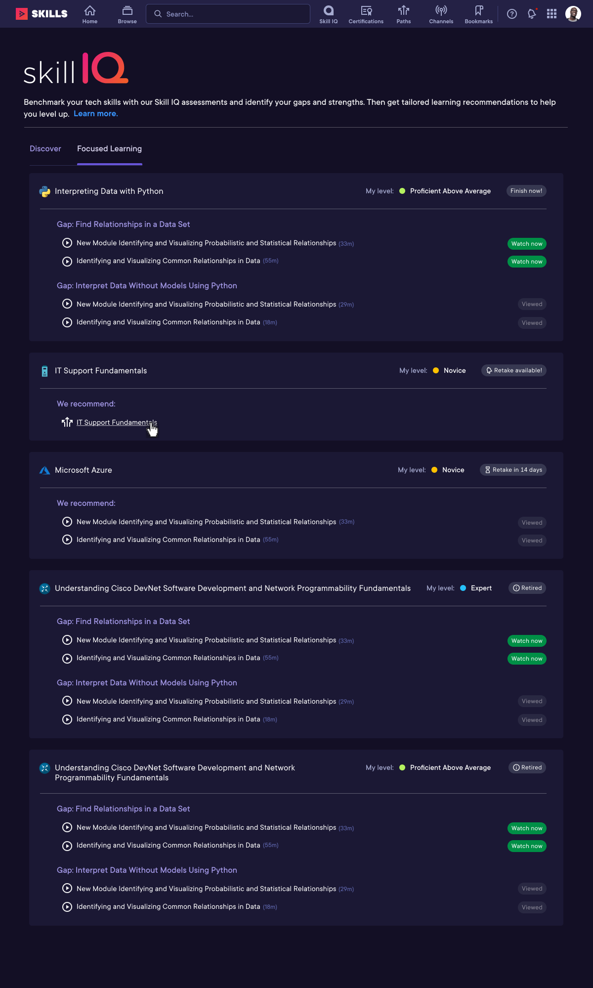
Focused Learning, content recommendations
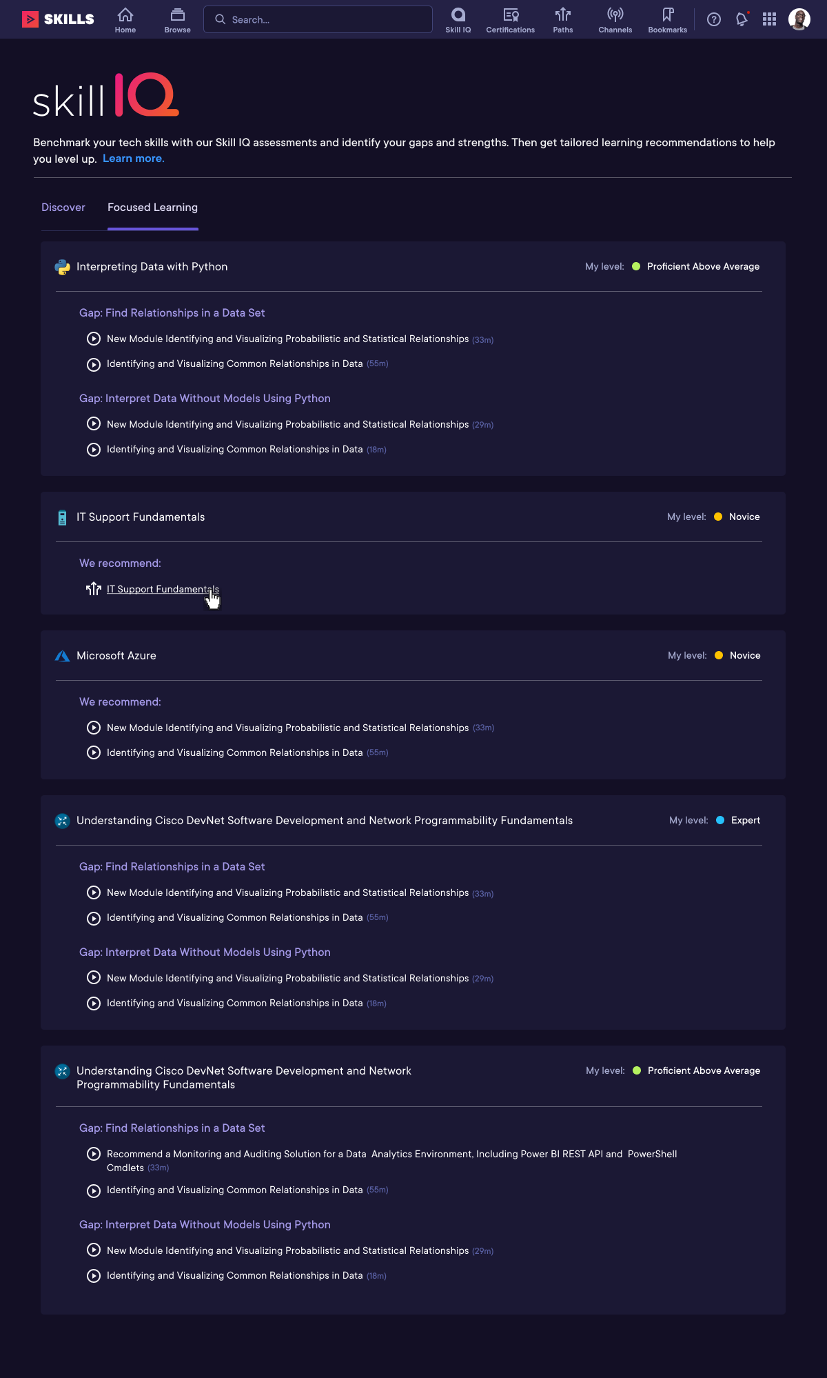
Focused Learning MVP
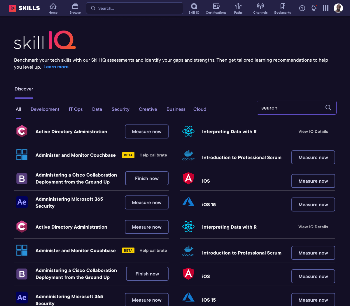
Discover, Product decision to leave functionality as-is with redesign later
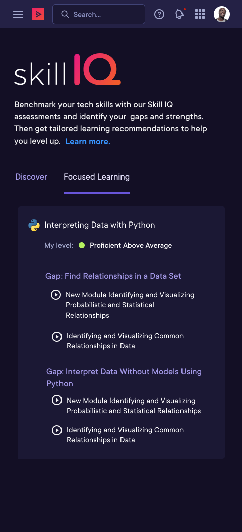
Mobile
Focused Learning empty state
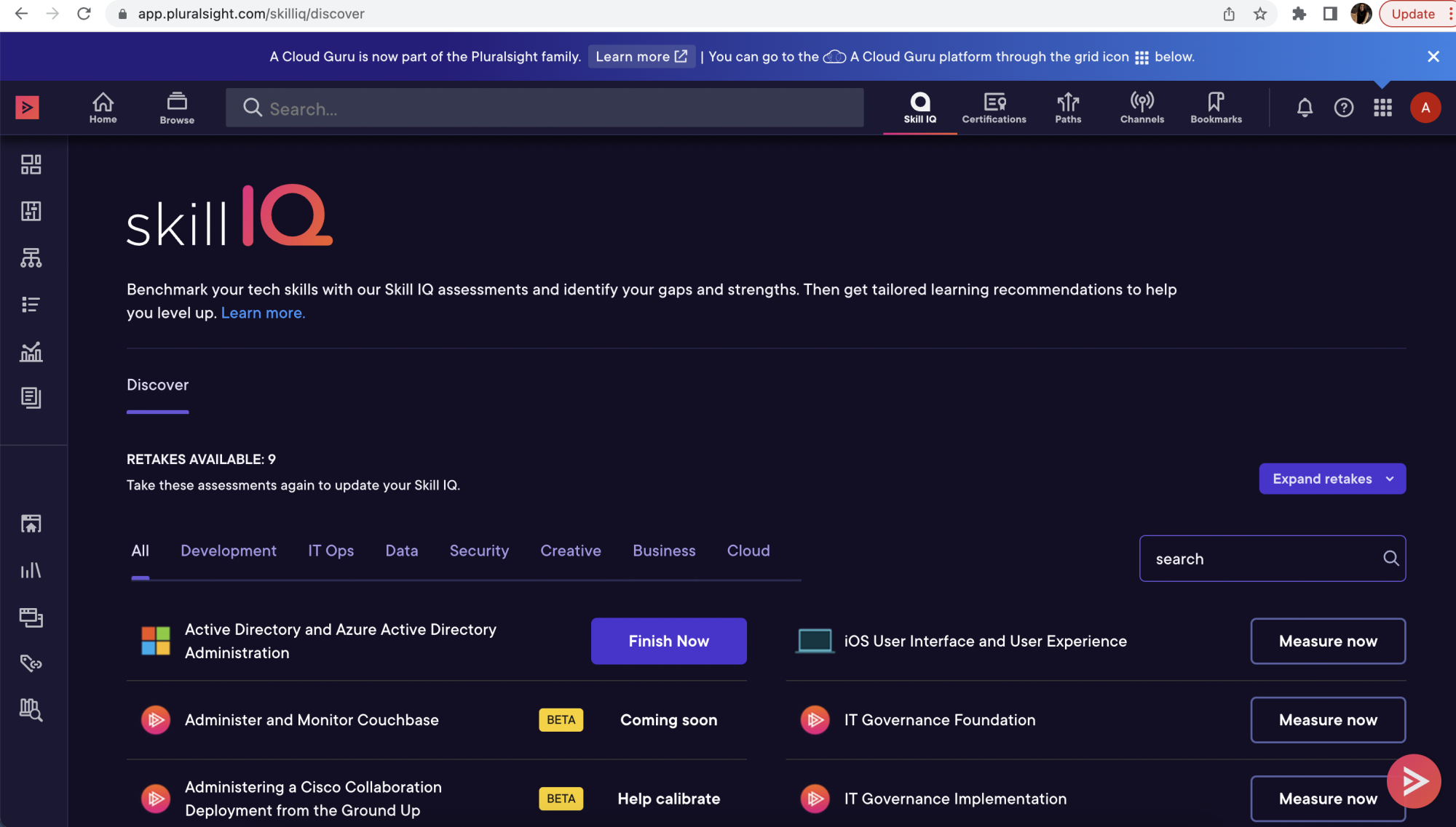
Screenshot of live website, first release May 2023
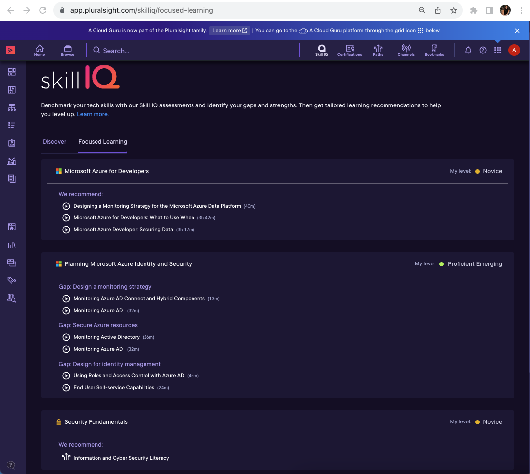
Screenshot of live website, release of Focused Learning tab Sept 2023
Skill IQ
Context:
Pluralsight is a leader in the eLearning space, helping to skill up the general public's technical skills B2C, as well as upskilling the B2B workforce. Pluralsight's market differentiator is their benchmarking assessment tool called Skill IQ, which grades users proficiency in various technical skills.
Problem to be solved:
The Skill IQ experience had not been updated in multiple years due to an emphasis on backend development work. When I was brought on-board, I was to help the Skill IQ experience generate more user engagement and increase overall value proposition of the tool.
My first action was to do generative research, to understand what the user pain points were with the product. I carried out various forms of research including reviewing past research documentation across the org, reviewed feedback that came in through various feedback channels, reviewed analytics, sent out surveys, and conducted user interviews.
After the first round of research, I put together workshops with the product team so we could identify the pain points and solutions with the most impact. We first identified a set of updates we felt we could release soon as quick wins. The first update was to pull in the Skill IQ logo that was being used in our Marketing materials. This would create consistency between our SaaS platform and our Marketing. Another quick win was collaborating with the Navigation team to add a Skill IQ item into the main nav. According to analytics, this is now one of the main pathways users take to get to the Skill IQ experience, accounting for 1/2-1/3 of funnel traffic. Later, I started to re-imagine the Skill IQ experience as a whole, focused on the specific problems at hand.
The existing landing experience had only been a list of assessments, vertically scrolling down the page. The new experience I designed was a tabbed interface, with each tab solving for a different use case. The first tab would be a dashboard (Skill IQ Dashboard), as an overview of the area with specific calls to action and other pertinent information. The second tab was dedicated to the skill assessments the user had taken (My Skills). The third tab listed all of the recommended video content the user could focus on to upskill quickly (Focused Learning). The fourth and last tab, gave the ability for the user to view and discover all the assessments that were available (Discover).
Each tab in the new design not only solved for the main pain points identified, but also solved for other barriers to entry and improved usability for various workflows.
During this project, Pluralsight was also moving to a new design system. You'll notice the original screenshots show black and blue coloring, where in the new designs I incorporate the new purple color palette.
The first step of the redesign was released in May 2023, with subsequent releases slated throughout 2023 and 2024.


